I had a great time exploring the Remastered versions of Tomb Raider I - III and I found myself distracted by the photo mode included to take pictures of the environments of the first three games.
That fact that you could switch between the old graphics and the new graphics made me use the photo mode even more - I found it just as enjoyable looking at the differences between the old graphics and the new graphics as I did playing the game properly.
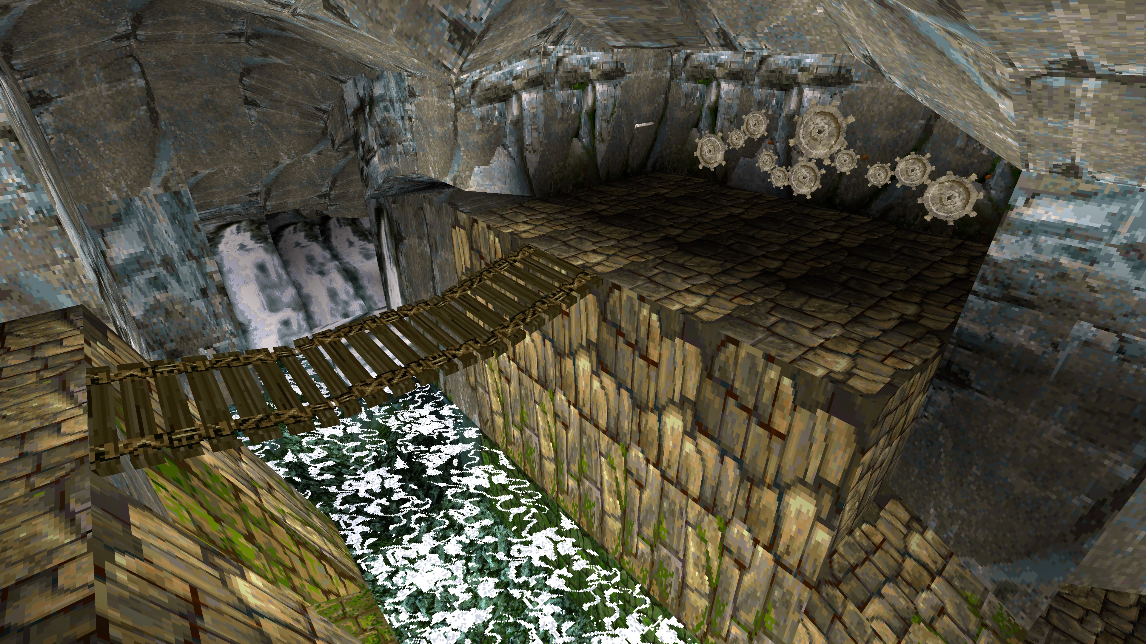
The new graphics look really nice and it is cool to see certain areas I remembered receiving an overhaul in the graphical department while still being quite faithful to the artistic vision of the original.
However, the new graphics update did seem to be both a positive and a negative. I like the realistic lighting of the remaster as they added rays of light shining through cracked ceilings where the original may not have had any openings. Although, at the same time the lighting of the original developers does interfere with the original developers idea as certain areas have been lit up in the original graphics as a hint which direction the player should head towards (this is just a minor grip as you can easily switch between the two graphical modes).
I found myself taking lots of screenshots with photo mode so I thought I would add them here to show some comparison between the old and new graphics.
Lara's Home


Peru Levels


Comments
Post a Comment